Here I have done a little research on construction health and safety posters,symbols and signs.
I have chosen this poster below as I like the layout and the way it is presented. The text at the top is bigger than the rest this is so people read it first and also because its important and tells you what the poster is about. The text 'what can you do' the word 'YOU' is in red so people think oh this is about me and it engages them to read more they also put it before all the steps as its a rhetorical question. The images are really simple images this is so its clear for people to see. The images explain step by step that people should wash their latrines and should also wear footwear.
This poster is presented good it only has 4 colours and it is not too crowded this is good so people can read the text. The text stands out because they have put white on a dull colour and red catches your attention. This poster clearly shows what they are trying to tell you just by looking at the image of a silhouette slipping on water. There isn't a lot of text this is why this poster will probably appeal to more people as not many people like to read a lot and it is a clear font.
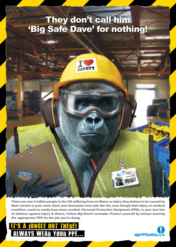
The two construction posters below with a gorilla on are funny and its better to have that bit of humour for people to laugh and listen instead of just a boring poster saying 'wear a safety helmet'. They have used a gorilla so they could use the quote 'its a jungle out there! always wear your PPE...' looking at an animal wearing human safety cloning looks funny and people are more likely to read it.

This poster below makes people realise that safety is a big thing when working on a construction site or with machinery and goggles are needed. Not wearing goggles in construction is dangerous and putting something like this on a poster makes people realise its the best thing to do. This poster is very subtle and only uses 3 colours. 'EYES' is in capitals as the main focus of the poster is eyes and its reminding people they only have one pair.

This construction poster below would fit well in a construction room as the colours are the main colours for a warning sign.

Here are a couple of images of construction symbols. Sometimes symbols don't need words. Using images like these ones below explain to wear safety.These symbols below show the most important things you have to wear when in construction.
This poster/symbol has a man wearing a safety hat but also has a question mark this is to make people reassure themselves about wearing a helmet.

Physical
Hard hat
Safety vest
Safety goggles
Gloves
Safety mask
Face protection
Boots
Behavioural
Running (no)
Spitting
Swearing
Careless
Focus/Awareness
After looking into behavioural things I could include on the poster I did a little research on spitting posters and I found the one below.

After looking at spitting posters I thought to myself what actually spits? after thinking this I thought of animals such as camels and llamas I went on to google images and found this image below of a camel smoking. I thought this would be a good starting point. It gave me an idea of putting a camel inside a suit but spitting not smoking.

I went onto google maps and searched for the college and took a screenshot of the oscroft so I could use it as my background.

After putting this photo into photoshop I then found a face of a camel and cropped the background out by using the magic wand tool.

I then went on to find a man wearing a suit so I could crop the suit out and place the camels head within the suit as though it is a camel wearing a suit.

This is what it looked like after i edited everything.

 |
| Fig. 1. Computational model of the interaction of the catalytic domain of HIV type 1 integrase (gray ribbons) with bound viral (white) and host (black) DNA fragments. The 2 DNA molecules meet over the catalytic site, which includes 2 metal ions (dark gray spheres). The terminal hydroxyl group of the conserved 3′-adenosine (shown as white spheres) of the viral DNA contacts 1 of the metal ions and also is near 1 of the strands of the host DNA. |

This image below is a real good peice to work from, the image is a mans head with constructionwork going off inside. It represents the brain is thinking about construction and i feel it would work well on a poster. The colours used are plain but the image stands out as its just black silhouettes.
By using the picture above I tried to make it look as though my male sign is thinking and asking himself have i got the right PPE? so I put all the different thinks he would need for safety into bubbles and making it into a thinking bubble, at the end of the thinking bubble he has the answer to the question but I feel this needs moving and people may not know why its there. The man on the bottom digging needs to be removed s it looks out of place.

Below I have gone from my last design and added the under construction bit i feel this works best as it is a poster for a construction site.

The image below is the same image as above but without the working man at the bottom.

I feel that this poster below works best as the yes is more clear and isn't at the end of the thinking bubble. the colours used are hazard colours which is black and yellow which would work well to get peoples attention to read the poster.

After doing this poster above I felt that it didn't have much potential and it was just all copied from the internet. i got the images of the poe of the web and put the into circles and tried to make it look as though it was a thinking bubble. and the man is just a copied image too. The text is close to the edge and the image below is just copied and pasted.
I went on to make a new poster firstly I started of by getting a fire exit sign and cropping its legs off and I ended up with the top half of the body.

I then got a male symbol and cropped its top half of so I was left with its legs.

Using photoshop I put both images I had left together to create the image below. I ended up with a silhouette of a man bending over. My initial idea was spitting so I thought I would stick to that.

Basicly I wanted this image so I could then put it into this background and change it from the original idea which was slipping. I went on photoshop and put the man in a position as if he was bending over to spit. The text had to be impact so it was clear to see.

The image below is made on photoshop I went into custom shapes and placed it onto my blank page I then added loads of different shades of blue and then used a blur pen to give it this effect. this was an idea for the sliver on the floor but i didn't like it so i just drew it on with pen.

As our group progressed towards our final designs we felt that a good flow of consistency would make the posters look more like a group rather than having a wide variety in designs. we came together and decided on two subject matters to focus on as an individual. I chose hygiene and spatial area. I then went on to do more research into hygiene and spatial are as I had a focus point then instead of trying to include all PPE.
More Research
As I researched into hygiene these posters below is what I found and liked.
The colours used in this poster is what caught my eyes the red and yellow work really well and the main focus of it is the image of a man with a breathing tube. this related to hygiene as he man is unable to breath due to work related health problems. this relates as dust is hygiene and dust makes it hard to breath if not wearing a dust mask.

I really like the way the image is just a silhouette and the text also links in with the mess on the floor as un-used items rot and the text also looks like it is rotting. The text is placed at the top a its the first thing you read also it is bold so it stands out.

The image below is of dust in a workplace or construction site. It shows that dust is a hazard and it could cause fires so it is very serious.

We all came to the decision of having a yellow image. We started this by converting the image to grey scale then applying the fresco filter, after this we applied yellow and black duotone and converted mode to RGB. We then went on to selective colours and reduced the cyan and magenta.After doing this we then went onto curves to increase the contrast. I did thos by using photoshop. Firstly i used my image from my previous poster to see what it would look like.


After editing my photo on photoshop I then went on to illustartor and set up an A3 document template. I set up guidelines 10mm from the edges and one down the centre this was so my text and image was spaced well. I created a black box over the top if my A3 document to create a black background. After creating the background I created a boarder 10mm from the edge using the rulers. The border was 8pt weight aligned to the side with round corners 6mm radious. I then inputed my copy line 'are you an animal?, well dont spit then' I did this by using impact typeface as it is clear but bold and adjusted the size and tracking as requiered. I then imported my photo from photoshop and created a rectangle over the top of my image and applied clipping making the photo grouped to the background. I then created a border for my photo 6mm weight and also it had round corners 6mm radious.

I then took my own photo of a college friend and using the magic wand tool I took away the background making it black. This is what it turned out like. I used my own sources as i felt it would work better and it links more to the construction side as he is wearing a dust mask. I thought i would stick to two subject within construction and mine was dust mask and spatial awareness.


I then created a background again in illustartor the same as i did previous with the camel, i did a border of 8pt weight with6mm round corners. I imported the image from photoshop that i had edited and put a boarder around it making it stand out. I used these colours as they are the colours of caution and warning, safety. The yellow and black work really well as the black is a dull colour with a Bright vibrant yellow standing out from the background.
I then appliied source of information from the internet relating to why people should wear dust masks.
I had a couple of ideas for my copy line but thought i chose the best from the list.
The risk is greater, if you dont use a respirator
Get it sussed keep out the dust.

Before doing this poster i had an idea of illustrating a fish bowl and a fish struggIng the breath out of water i thought this was a clever idea but wouldnt relate to constrution. Below is my illustration

Here is my illustration put into photoshop and tidied up a little. I used selective colour to make the background white by reducting the cyan and magenta and increasing the white and black.

I then put a fresco filter on it but it wasnt clear to see what the image was so I changed the background black but Iost a vast majority of detail. I figured out I didnt like this idea after all so I moved onto taking my own images instead of illustrations.

I then moved onto my poster for spatial awareness I took an image of a messy area. This was to show that people can't work in a mess.


I then placed my image into an A3 template on illustrator same as before but thistime it was a different iinage and copyline. I then again went onto the internet and searched information relation to my subject matter spatial awareness and place it at the bottom of my poster. I couldnt think of a unique copyline so i jotted a few ideas down and this is the one i liked best. Some of my copylines were
Dont think your ace be cautious of tyour space
Dont place in someone elses space
Your out of place when using someone elses space
Just be ace and respect the space
Dont be a discrase thats someone elses space

No comments:
Post a Comment